


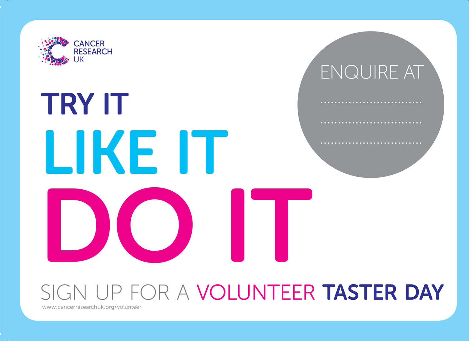


This is an A3 poster. It is produced as an interactive .pdf file - meaning that the details can be completed locally by those involved in the project without reference to head office.
This one is right to the point and uses my own copy.
Three distinct roles were identified within the stores each of which needs volunteers. This one is all about preparing stock for retail.
The brand guidelines for CRUK are very tight, as befits a national charity. I was very pleased to add this "shopping bag" design to their vocabulary. Used here with the "sticker" idea, this poster of two halves holds together despite the strong elements paired.
This one is about Merchandising.
This one is about sales.
This book makes use of several elements from the wider campaign as well as good editorial design and layout.
The most abstract page I managed to get accepted!
This leaflet is aimed at store managers looking to recruit volunteers through Job Centre Plus. It was a second commission from CRUK - who had been very pleased with the work undertaken for the initial campaign.
The legal niceties are quite complex, so it was important to make things very clear while at the same time retaining all of the branding elements that had been used in the earlier commission.
This was designed as an epublication. It opens itself and lets the user "flip" the pages using special transitions to simulate a physical magazine. In this case a smaller number of copies was also printed and distributed to local store managers across the country.
As you can see, I managed to keep the design, once approved, and apply it consistently across the whole project.
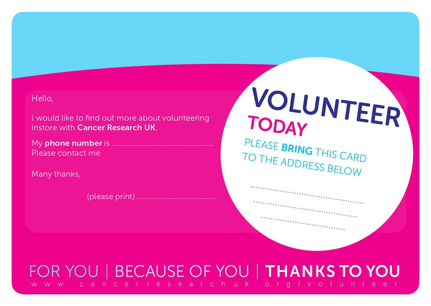
This option didn't make the cut but the brand guardians permitted it once the "volunteer sticker" was rendered horizontal.
I was very pleased with the "for you, because of you, thanks to you" copy here.
This was the first iteration of the "sticker" design which was eventually adopted after it had been made horizontal. The idea of collecting details from potential volunteers had to be revised because of data protection responsibilities for the charity.